Coach Phaseout
Introduction to Coach Phaseout
What is Being Phased Out? The phaseout of Coach refers to the transition of its features from a standalone tab within the Vymo SPM platform to an integrated part of the performance tab. This includes all the current widgets and tools housed within Coach.
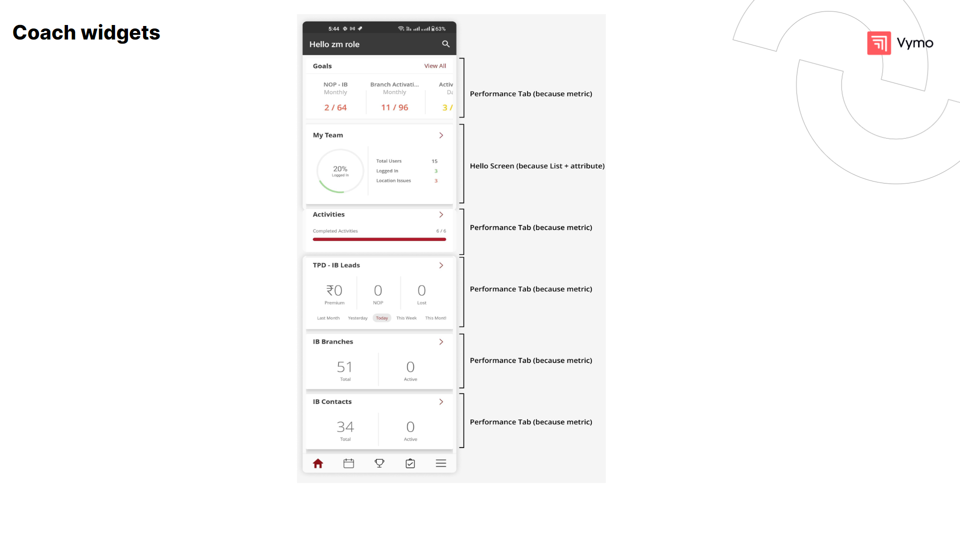
Where Will It Be Phased Out From? Coach features will be phased out from their original location in the app and will be reintegrated within the main performance dashboard for streamlined access. The transition within the Vymo app is focused on migrating various sales and performance management widgets to areas where they fit best functionally. The goal-centric widgets, which provide monthly numerical targets and achievements, are moving to the Performance Tab, aligning with its focus on detailed metrics and analytics.
The team engagement widget, which includes login percentages and location issues, is transitioning to the Hello Screen. This is to give users a quick overview of their team's status as part of the initial interaction with the app.
Activity-related widgets that summarize daily tasks and completions are also shifting to the Hello Screen. This change is intended to provide users with immediate access to actionable items upon logging in.
Lead management widgets, detailing numbers of premiums, new opportunities, and lost leads, as well as branches and contacts information, are now found in the Performance Tab. These widgets are inherently metric-driven and thus are integrated into the area of the app dedicated to performance tracking and analysis.
Reasons for the Phaseout The phaseout is driven by the need to streamline the platform, reduce redundancy, and enhance user experience by consolidating key features into a single, more efficient interface.
Implications for Users and Coaches Users and coaches will experience a more integrated environment with improved navigation. While the fundamental tools remain, their presentation and accessibility will be refined.
As we continuously evolve to meet the dynamic needs of sales performance management, Coach is being phased out and its core functionalities are being integrated into the performance tab. This transition represents an advancement in our platform, ensuring that the insightful and empowering features of Coach continue to enhance user experience in a more streamlined and integrated manner.
The updated experience in the performance tab retains the essence of Coach, offering advanced widgets and tools that have been refined and optimized for modern sales teams. Users can now access these familiar features directly within the performance tab, benefiting from a more cohesive and seamless interface.
This guide provides an overview of the phased-out Coach and introduces the upgraded experience, highlighting how the core widgets and analytics tools are now part of the performance tab. Embrace the new layout and functionalities as we take a step forward in our commitment to providing intuitive and effective sales performance management solutions.
Welcome to Coach, an innovative feature of the Vymo Sales Performance Management platform designed to guide, empower, and enhance the productivity of sales teams. As a strategic tool, Coach is your digital mentor, providing insights, recommendations, and real-time data to sharpen your team's focus and drive sales effectiveness.
With Coach, sales managers, and teams are equipped with a powerful suite of widgets and analytics tools tailored to foster a culture of continuous improvement. The feature’s intelligent insights help you understand performance gaps, set realistic and challenging goals, and execute strategies that align with your company's growth objectives.
Differences from the Old Experience Unlike the old Coach, the new experience will be more integrated into the daily workflow, with a focus on ease of use and more relevant data display.

Key Benefits of Coach phaseout:
-
Personalized Dashboards: Customize your view with widgets that matter most to your role and objectives.
-
Goal Setting and Tracking: Set measurable goals for your team and track progress in real time, making adjustments for optimal performance.
-
Actionable Insights: Receive data-driven suggestions and alerts that help you prioritize tasks and coach your team effectively.
-
Performance Visualization: View performance trends and patterns with intuitive graphs and leaderboards, encouraging a competitive and results-oriented environment.
-
Activity Management: Provides a clear overview of sales activities, helping teams prioritize tasks and follow up effectively.
-
Lead Management: Offers insights into lead engagement and conversion potential, helping target high-value leads for better sales outcomes.
-
Partner Management: Delivers detailed information on partner interactions and performance, aiding in building stronger business relationships.
Old User Journey:
-
Separate Coach Tab: Users had to navigate to a specific Coach tab to access insights and action items.
-
Dispersed Functionalities: Key metrics, team performance, and daily activities were spread across different tabs or sections of the app.
-
Multiple Steps for Access: Users may have needed to take additional steps to view their calendar, plan routes, or analyze performance data, possibly moving back and forth between different tabs.
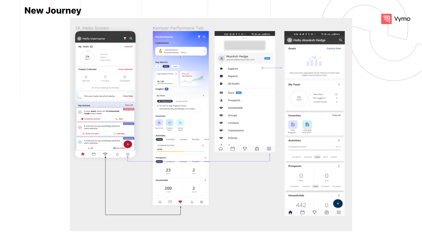
New User Journey:
-
Integrated Hello Screen: The Hello Screen now serves as a central dashboard, consolidating daily activities, team status, and action items in one place.
-
Streamlined Navigation: The need to switch tabs is reduced, as users can access most of the actionable insights and tasks directly from the Hello Screen.
-
Performance Tab for In-Depth Analysis: Detailed analytics, such as leaderboards and key metrics, are now located in the Performance Tab, providing a focused space for comprehensive performance review.
-
Enhanced Accessibility: Frequently used tools and reports are now available under Favorites, reducing search time and increasing efficiency.
-
Simplified Metrics View: Completed activities and prospect statuses are more conveniently presented, with easy-to-use filters for timeframes, enhancing the ability to track progress and outcomes.
USER JOURNEY WHEN COACH PHASEOUT IS ENABLED NOT ENABLED
Refer to https://docs.getvymo.com/en/master-internal/topics/coach_hello/
USER JOURNEY WHEN COACH PHASEOUT IS ENABLED
-
Log in to the vymo app. The Coach Hello Screen is displayed.
-
Tap the hamburger icon in the lower right corner of the screen.
-
Tap Coach. You're taken to the Hello screen of the coach.
HELLO SCREEN after the coach and performance tab is enabled
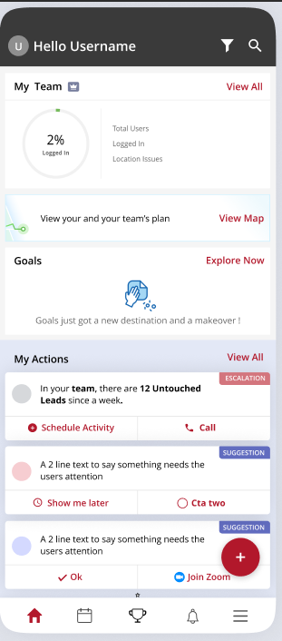
Login and Overview: Upon logging into the Vymo SPM platform, you will be greeted by the 'Hello' screen. This is your central dashboard where you can quickly glance at your day's priorities.
My Team Widget This section provides a quick overview of team engagement with the application.
Check the status of your team with the 'My Team' widget. You can see the percentage of team members logged in and any location issues. For more details, tap on 'View All
-
Progress Indicator: The green arc visually represents the percentage of your team currently logged into the app.
-
User Breakdown: Below, you'll see the total number of users, how many are logged in, not logged in, and those with location issues. View All on the right for detailed metrics and to take action on any issues identified.
View Map The app encourages you to "Plan your route; see who's nearby" to optimize field sales efforts. Press 'Enable Location' to allow the app to access your location and provide real-time directions and nearby contacts
My Actions
Below your calendar, you'll find 'My Actions' where you can address untouched leads, schedule activities, and make calls. You can also respond to suggestions and reminders.
PERFORMANCE DASHBOARD after coach is enabled
With detailed UI components like the "Performance Leaderboard", you can zoom into specifics, track rankings, and understand metrics that drive success. Vymo SPM is your comprehensive tool for a 360-degree view of your team's performance.
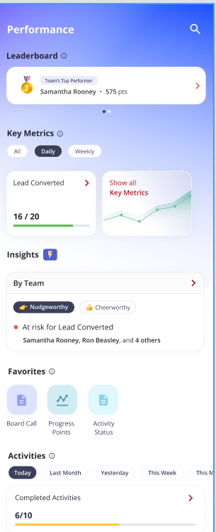
1 - Team Rankings: This is the main component, which displays a list of the top performers in order of points earned by them. Each row in the leaderboard includes the following information:
2 - Rank: The team’s top performer's current rank on the leaderboard.
3 - Name: The team’s top performer's name.
4 - Points: The team’s top performer's total number of points.
5 - Key Metrics: This section displays the key metrics used to rank performers on the leaderboard.
6 - Favorites: Users can pin their favorite reports in this section.
In addition to these main components, the Performance Leaderboard dashboard also includes several other UI elements, such as:
9 - SearchBar: The search bar allows users to search for specifics.
10 - Filter Bar in Key Metrics: The filter bar allows users to filter the leaderboard by different criteria, such as daily, weekly, and monthly.
11 - View All: The View All button allows users to access additional features that are marked as favorites, such as the User Progress Dashboard and User Goal and Achievement Report.
Leaderboard:
My Team's Standings: manager dashboard my teams standings
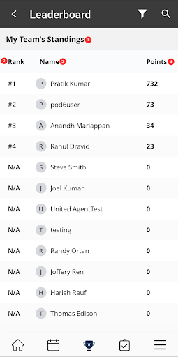
1 - My Team's Standings: A section that shows the user's team's current ranking and points earned.
2 - Rank: The team's current rank on the leaderboard.
3 - Name: The team member's name.
4 - Points: The total number of points earned by each individual in the team.
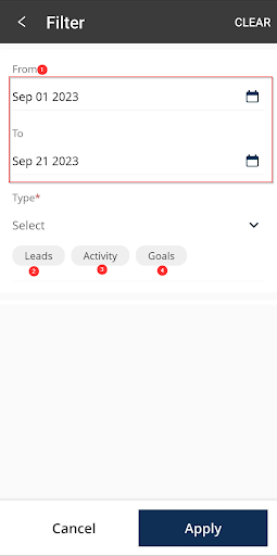
FILTER BUTTON: Search options within my team’s standings.
manager dashboard filter button 1 - Time Period: This filter allows users to filter the leaderboard by specific From and To dates.
2 - Leads: This filter allows the user to filter the leaderboard by lead transitions or creation.
3 - Goals: This filter allows the user to filter the leaderboard by a specific goal set by the higher authorities. This can be useful for tracking the performance of a specific team or comparing the performance of different teams and their goals.
4 - Activity: This filter allows the user to filter the leaderboard by a specific activity. This can be useful for tracking performance on a specific activity or comparing performance on different activities.
Self Leaderboard The self-leaderboard is the agent’s stack rank against his/her peers. The points earned are the number of points that the user has accumulated. The points earned are typically calculated based on the user's performance towards their goals.
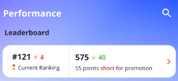
Current Ranking: The user's current rank on the leaderboard.
Points Earned: The user's total number of points earned by them.
My Standings
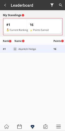
1 - My Standings: A section that shows the user's current ranking and points earned.
2 - Rank: The user's current rank on the leaderboard.
3 - Name: The user's name.
4 - Points: The total number of points earned by the individual.
FILTER BUTTON:
 Search options within my team’s standings.
1 - Time Period: This filter allows users to filter the leaderboard by specific From and To dates.
2 - Leads: This filter allows the user to filter the leaderboard by specific lead transitions or creation.
3 - Goals: This filter allows the user to filter the leaderboard by a specific goal set by the higher authorities. This can be useful for tracking the performance of a specific team or comparing the performance of different teams and their goals.
4 - Activity: This filter allows the user to filter the leaderboard by a specific activity. This can be useful for tracking performance on a specific activity or comparing performance on different activities.
Note: Peer ranking is determined by agents that report to the same manager.
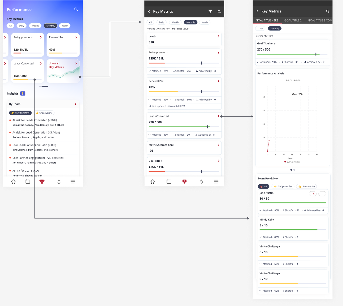
Key Metrics
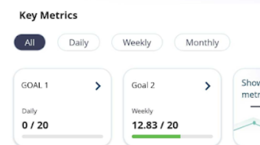
Why Use Key Metrics? Customizable Metrics for Your Needs: Whether it's leads created, activities completed, or external data like policy premiums collected, Vymo SPM allows you to define and track the metrics that matter most to you and your organization.
Frequency Flexibility: You can configure your metrics to be updated daily, weekly, monthly, quarterly, or yearly. This means you can track short-term objectives and long-term ambitions with equal ease. Target Setting: Beyond just measuring, you can set specific targets for each metric. Once set, your achievements will be juxtaposed against these targets, enabling a clear view of your progress.
Visual Indicators: Set thresholds to give color-coded visual feedback. At a glance, determine if you're on track or if a particular goal is at risk.
Managerial Insight: If you're a manager, the drill-down feature lets you delve into the detailed performance metrics of your team members. It empowers you with the data you need to guide, support, and make informed decisions.
The key metrics come equipped with filters for daily, weekly, monthly, quarterly, and yearly views. It's a straightforward way to zero in on the data that's most pertinent to your current objectives.
manager key metrics shortfall 2 - Shortfall: This section shows the difference between the user's goal and the number of points they have attained. For example, if a user has a goal of earning 100 points per day and they have earned 50 points, their shortfall would be 50 points.
3 - Attained: This metric shows the percentage of the target that the user has achieved. For example, if the target is 500 and the user has achieved 250, then 50% of the target has been attained.
4 - Achieved by: This section shows As a manager it shows how many reporters under him achieved the target for that particular goal.
Historic Trend The historic trend section of a user progress dashboard typically depicts the user's progress over time. The historic trend section can be used to: - Track progress over time: By tracking their progress over time, users can see how they are progressing towards their goals. This information can be used to identify trends and to make adjustments to their goals as needed. - Identify areas where improvement is needed: By comparing their current progress to their previous progress, users can identify areas where they need to improve. For example, if a user's progress has slowed down, it may be time to increase their efforts or adjust their goals.
Performance Progression Analysis If you swipe right on the historic trend you will be taken to the performance progression section that can be used to identify trends in the user's progress. The graph shows the user's progress toward a goal over time.
User Journey of key metrics
-
Key Metrics Summary: Users are presented with a summary of performance indicators such as policy premium, renewal percentage, and leads converted.
-
Goal Tracking: Each metric includes a progress bar that shows the current status against goals with details on what's been achieved and the shortfall.
-
Detailed Analytics: A graph section provides a visual representation of performance over time.
-
Team Performance: A breakdown shows individual team members' contributions towards the metrics.
-
Real-Time Data: The dashboard includes timestamps indicating the latest updates for each metric.
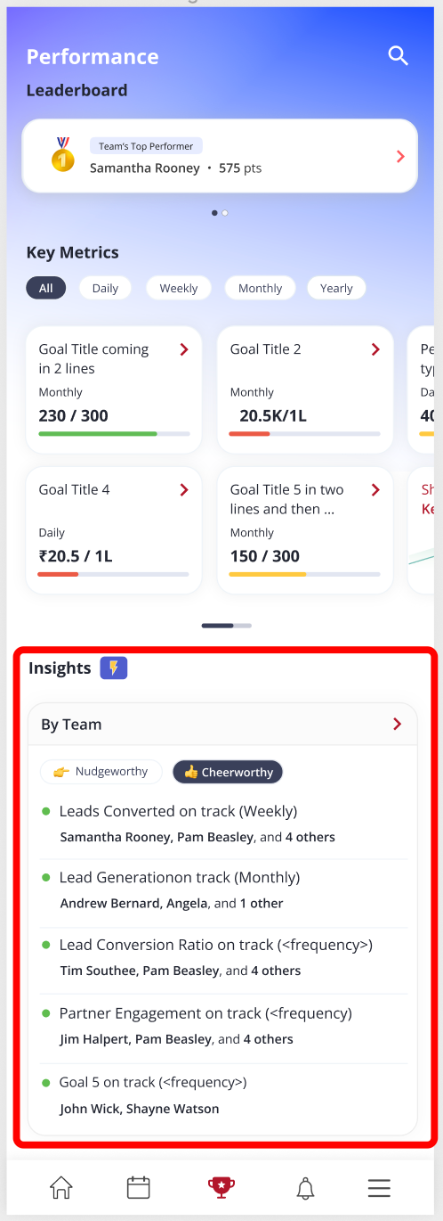
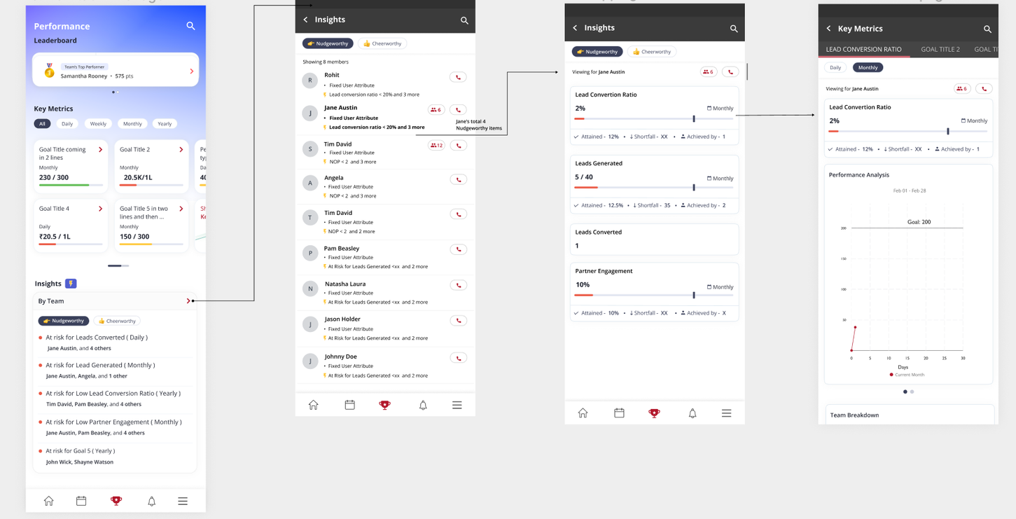
Insights
Introduction to the Team Insight Widget
The Team Insight widget is a key feature of our Performance Dashboard, designed to empower both managers and team members with real-time, actionable insights into performance goals. This guide will introduce you to the functionalities of the Team Insight widget and how it can be leveraged to enhance team performance and goal attainment.
For Managers
Quick Overview of Team Goals Immediate Visibility: See at a glance which goals require your attention without the need to check each one individually.
Prioritization: Focus on the areas where your intervention can have the greatest impact.
Proactive Management Threshold Settings: Set specific performance thresholds for each goal to identify when a team member may need support.
Performance Tracking: Receive automated alerts when team members risk falling below their goals.
Celebrating Success Recognition: Use the upper threshold indicator to identify and acknowledge team members who are excelling, fostering a positive team environment.
For Individual Contributors
Personal Goal Tracking Self-Monitoring: Keep track of your progress towards each goal with clear visual indicators.
Performance Improvement: Identify which goals you are on track to meet and which require extra effort.
Stay Ahead of Your Goals Early Intervention: The widget helps you stay proactive by alerting you when you are at risk of not meeting your goals, allowing you to adjust your strategies in time.
How It Works
Setting Up Thresholds Custom Thresholds: As a manager, you can define what constitutes on-track and at-risk performance levels for your team's goals.
Automated Calculations: The system will automatically calculate the progress needed to stay on track for each goal, providing a benchmark for performance.
Monitoring and Adjusting Real-Time Updates: Monitor your team’s progress in real-time with continuously updated data.
Adjustments: Make informed decisions on where to allocate resources and how to guide your team based on up-to-date performance insights.
Motivation and Guidance Positive Reinforcement: Use the widget's data to offer timely praise and motivate your team.
Focused Support: Quickly identify where individual team members may need coaching or additional support.
The nudgeworthy and cheerworthy sections of a user progress dashboard are two sections that are designed to encourage users to improve their performance.
1 - Nudgeworthy The nudgeworthy section is designed to help users identify areas where they may need to improve their performance to achieve their goals. This can be done by comparing the user's performance to a threshold that has been set for a particular metric.
2 - Cheerworthy The cheerworthy section is designed to help users identify and celebrate their achievements to motivate them to continue to improve their performance. This can be done by comparing the user's performance to a threshold that has been set for a particular metric.
Note: By default, users are nudged if their estimated achievement is below 20% of the target, and cheered on if it is above 80%.
Widgets
New Widgets Introduced New widgets in the new Coach experience include:
A refined Team Insight widget for performance overview.
Enhanced goal-specific widgets that provide alerts and thresholds.
How Widgets Work These widgets use real-time data to provide users with a visual representation of their performance metrics, with customizable thresholds to signal when attention is needed.
Benefits of Using Widgets These widgets offer users immediate visibility into their performance, proactive management of their goals, and a more engaging way to track progress.
My Team card
This card has the following information about all of the people who report to you and the people who, in turn, report to them.
The information is for a single day (where the day is reckoned to start at midnight).
-
Percentage of logged-in users, which is a graphical representation of the ratio of people who're logged in to the total number of people down your reporting chain
-
Total users, which is the number of people down your reporting hierarchy, including you
-
Logged in, which is the number of people who are logged in to the app in the day
-
Not logged in, which is the number of people who have yet to log in that day
-
Location issues, which is the number of people whose location information hasn't been detected in the last 30 minutes
How is the counting done?
The counts don't include people who did log in that day but, then, are logged out.
So, for example, if 7 people report to a manager, and 2 people log in early morning and then log out before the manager opens the My Team card, and 1 person is logged in when the manager sees the My Team Card, the numbers are like this:
Percentage of logged-in users: 29% (which is 2 of 7)
Total users: 8 (which is manager + 7)
Logged in: 2 (which is manager + 1)
Not logged in 4
Location issues: 0
You can tap on the arrow and drill down to a specific person .
You can also filter your team list to see only those people who are logged in, not logged in, or are facing location problems .
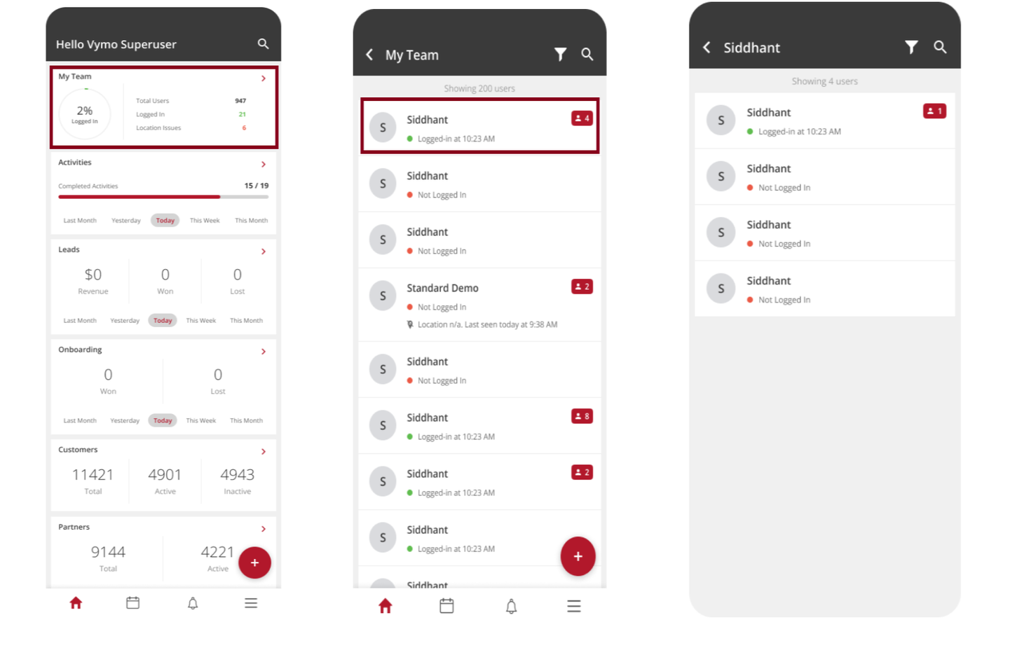
| Planned Activities | Completed activities | Logged activities |
|---|---|---|
| Planned activity counts depend on meeting date of activities. | Completed activity counts depend on completed date of activities. | Logged activity counts depend on activities from a log source, such as meet, talk and more such activities. |
The filters to view activities include the following - Last Month - Yesterday - Today - This week (Sunday marks the beginning of the week). - This Month
If you see any activities that have been open for a while, you could follow up with the person to whom the activity's been assigned, and guide them through the steps needed to close that activity.
Activity logic: completed + logged activities / scheduled activities + logged activities. Leads card
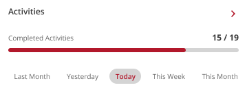
This card shows the number of leads won and lost, and the generated revenue for a day. The numbers are for leads assigned to you and your team. Tap the arrow in the card to see the leads list, which you can filter by several parameters. If you see a lead that's been in an open state for a long time, you might consider guiding the person who owns that lead to convert the lead into a win.
Leads Card
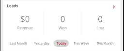
This card shows the number of partners assigned to you and your team, categorized by their tiers, which are determined according to the importance assigned to a partner. Tap the arrow in the card to see the details. Along with the number of partners assigned to you and your team, this card displays total active and inactive partners.
Partners Card
 This card displays the number of planned and completed activities that day for your team. The numbers include your activities too. You can filter the list on a user, or on any of the configured attributes.
Favorites
The Favorites section of Vymo SPM is your personalized hub for swift and efficient access to crucial data points. Tailor your dashboard by pinning relevant widgets, metrics, or reports, ensuring that your most-used tools are always just a click away. As the sales landscape evolves, so can your Favorites, allowing for a dynamic and adaptable experience. Whether you're streamlining your workflow or collaborating with team members, the Favorites feature is designed to elevate your Vymo SPM experience. Embrace organization, accessibility, and control, all in one place.